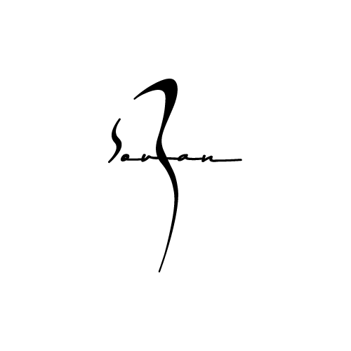
Souzan Naghavi
This personal brand identity was developed for Ms. Suzan Naghavi, a brand executive seeking to replace her traditional handwritten signature with a distinctive, modern personal logo that could represent her professional presence across digital and print platforms.
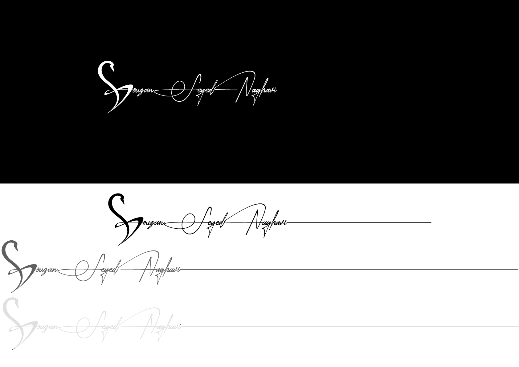
The logo centers on a swan, chosen for its symbolism of calm strength, understated confidence, and graceful leadership—qualities that define Ms. Naghavi’s professional character. The primary color, black, reinforces her authority and strategic presence, creating a timeless and executive visual tone.
To complement the emblem, I designed a custom typographic signature that is intentionally separate from the logo yet visually connected through a continuous horizontal line extending toward the right side of the layout. This line serves a dual purpose:
• Psychologically, it guides the viewer’s eye beyond the initial frame, encouraging curiosity and prompting them to explore additional information.
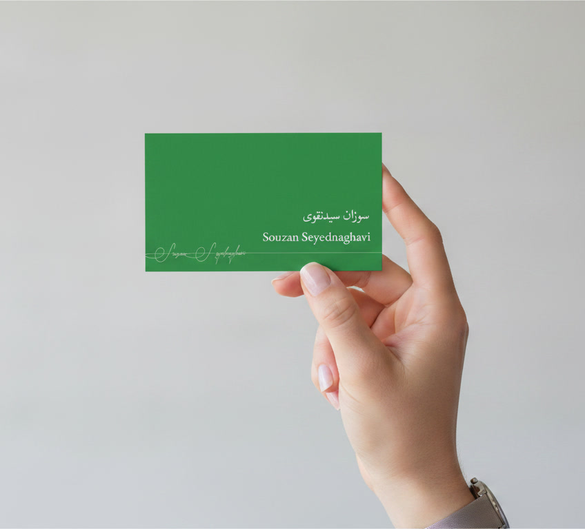
• Functionally, it mirrors the interaction pattern used in her business card, where the front design subtly directs the audience to flip the card and discover her contact details on the back.
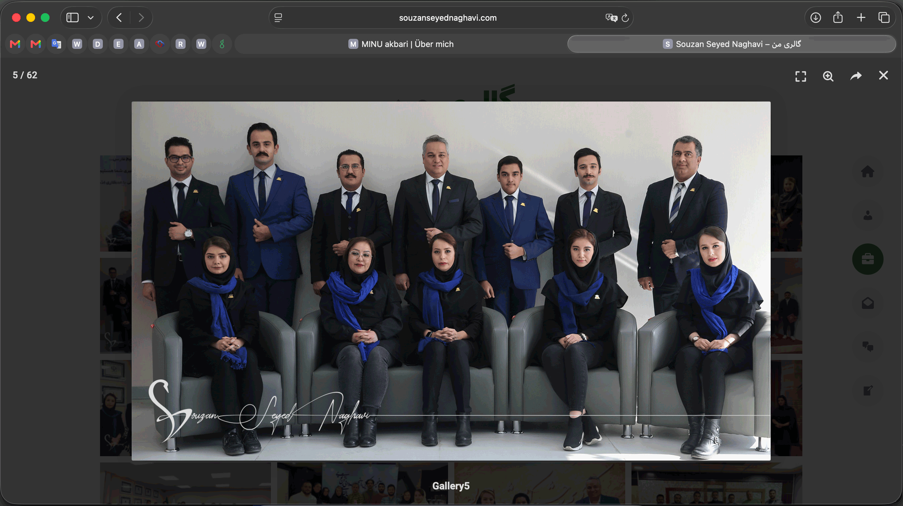
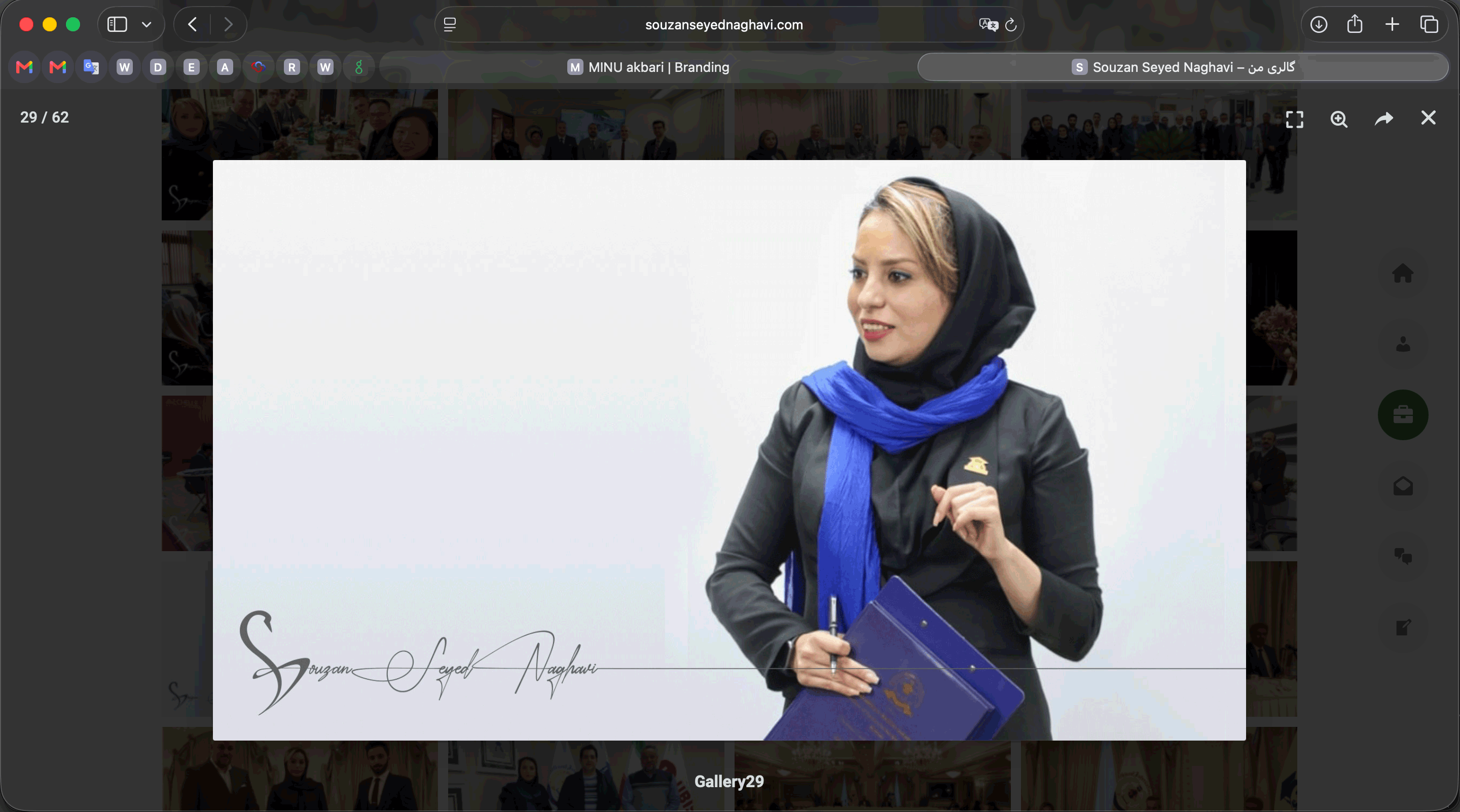
The combined logo and typographic system is also applied across her personal website, where it personalizes photography and reinforces a cohesive brand presence.
For her business card, the front side incorporates the primary color of her company, ensuring alignment with the brand she is most publicly associated with while maintaining the integrity of her personal identity.