Mino
a sustainable branding studio rooted in ecological harmony, resilience, and design ingenuity. Named after the "minor" musical scale—subtle yet essential—it embodies the belief that small, intentional actions can regenerate lasting value for both people and the planet. The identity began with a transitional typographic logo, elegant yet approachable, establishing early recognition before evolving into a more symbolic visual language.
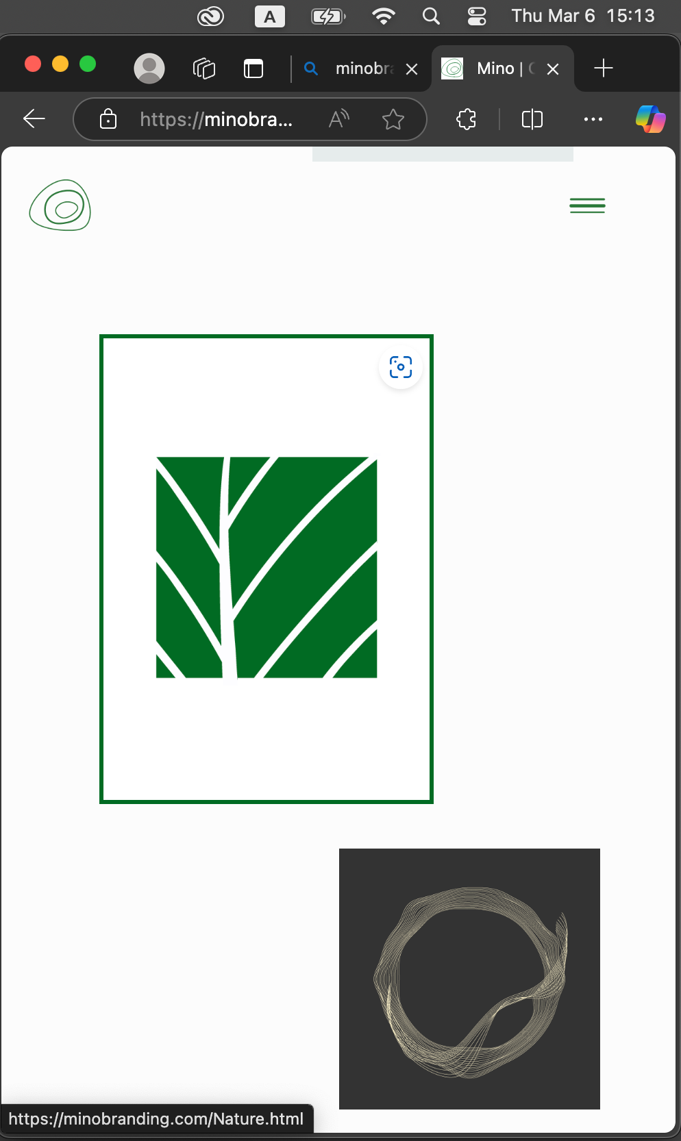
Inspired by geological contour maps and the organic growth of tree rings, I designed a scalable visual system that reflects resilience, continuity, and Earth's layered narratives. Fluid forms transform into flexible patterns across every brand touchpoint, while adjustable opacity and layered compositions balance clarity with complexity. Supported by a nuanced green palette and narrative-driven design, the identity unfolds as a living visual ecosystem—one where sustainability, storytelling, and strategic branding evolve together.